Since the beginning of our business story, many things changed but not our desire to renew, the research for continuous improvement and the passion for technology.
During these 40 years, our logo has been updated few times.
The last step of this evolution has been made few years ago, in the 2015, but the same meanings are behind this logo.

The original logo was designed in the 1974, many nights after long working days.
There where the drafting table, the ruler, a pencil, the transferable letters and lines and young creative guys. The target was to design a simple but very clear logo which could identify the main business on avionic market: that night we reached it.
The result was very easy to design and to replicate using manual engraving machines and even if the main business was in the helicopters market , the fixed wing was easier to sketch and was used to represent the avionic market.
The first evolution comes twenty years later: we added the Italian flag to highlight that our products are made in Italy, and a fast remind to one of the main business of the company: Opto-electronic equipment.
The drafting tools changed from drafting table to Autocad, ruler to mouse and pencil to keyboard but the old logo was still actual and was reused as it is.
Unfortunately a lot of new potential customers misunderstood the name of the company and called us optronic equipment but the Italian flag was so fascinating that the new design has been used for fifteen years.
In the 2013 we decided to restyle the logo launching a web contest. Many designers participated at this contest and we worked hard to select the best proposal.
The new logo slept for two years and, like a good wine, gets better with age refining colours and geometries.
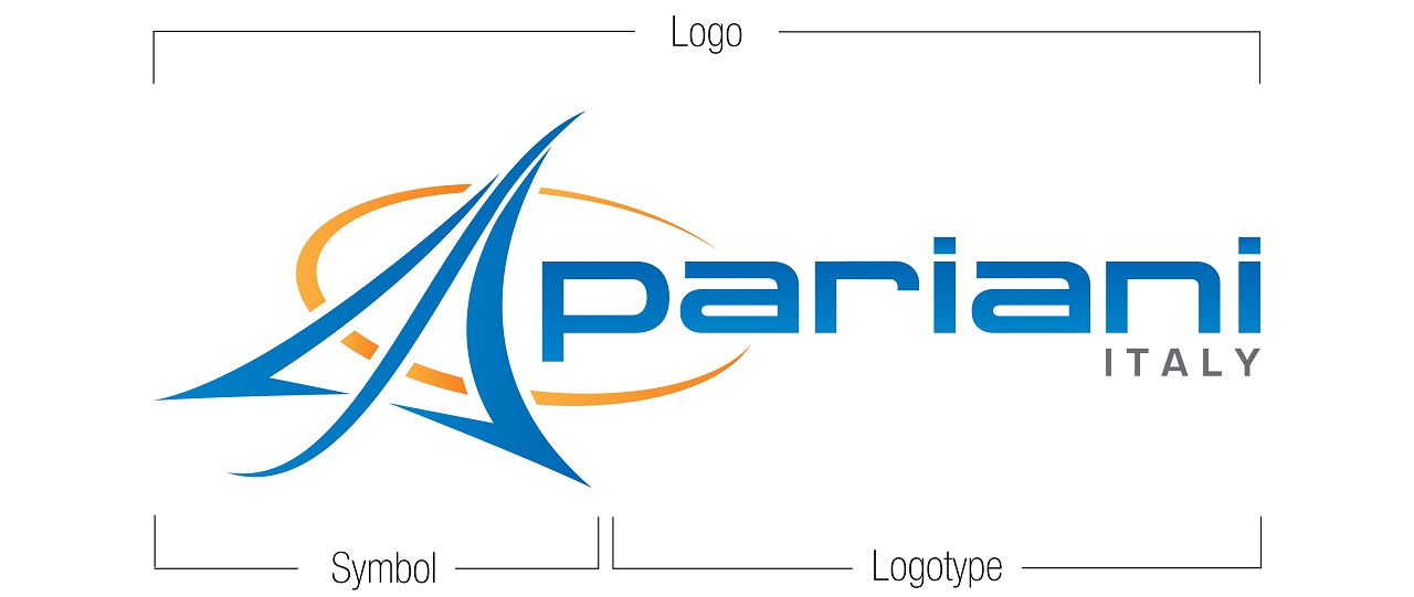
The result is the actual logo that features a simple and straightforward design with two components: the logotype and the symbol.

For the logotype, we are using a modern blue lowercase font , for the symbol, that is very important in a world of digital motion, we want to illustrate the emblem of our core business.
You will notice the distinctive signs of all the previous ones:
– The “A” of Adriano, our founder
– The ellipse that represents our planet
– The plane, emblem of our core business
– Our name, “Pariani”, to which we wanted to give greater prominence
– ITALY, because we are proud of our country and to be part of that excellence that wants to keep the “MADE in ITALY”
Looking carefully, you will notice other recalls:
– Sailing, because even boating is an important sector of our business
– The “S”, the initial of the owners.
The color scheme represents purity and optimism (blue) and harmony, creativity and trust in ourselves and in others (orange).
When we come to our logo, we see simplicity as being key of the message we want to pass to our customers.
